Brand
The SupplySphere visual identity
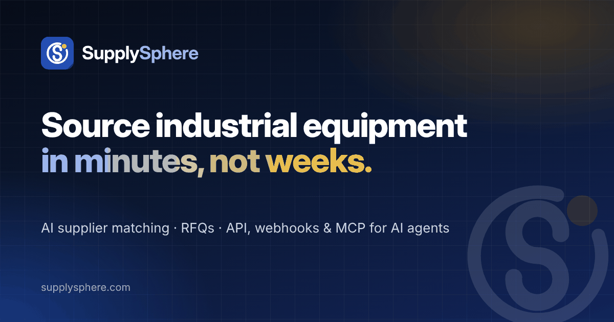
An orbiting sphere that forms an “S”, with a single amber node: the right supplier, found within a connected world of supply.
Logo
Primary lockups
Use the full logo wherever space allows. Keep clear space equal to the height of the amber node on every side, and never set the logo smaller than 24 px tall.


 App mark
 Mark · blue
 Mark · reversed
 Mark · single colour
Colour
Palette
Blues carry the brand; amber marks the moment of a match. Click a swatch to copy its hex value.
Brand gradient · #2563EB → #1E3A8A (135°)
Typography
Typefaces
Display & headings · Plus Jakarta Sans 700–800
Source smarter.
Interface & body · Inter 400–600
Rank suppliers for any requirement with transparent scores.
Code & data · JetBrains Mono 400–500
POST /api/v1/match
Wordmark · Inter Display Bold (outlined in logo files)
SupplySphere
Usage
Do & don't
- Do use the tile mark for favicons, app icons and avatars.
- Do use the reversed logo on Midnight or photography.
- Do write the name as one word: SupplySphere.
- Don't recolour the amber node or add effects to the mark.
- Don't stretch, rotate or outline the logo.
- Don't place the blue logo on busy or mid-blue backgrounds.